SOZER JEWELRY UI
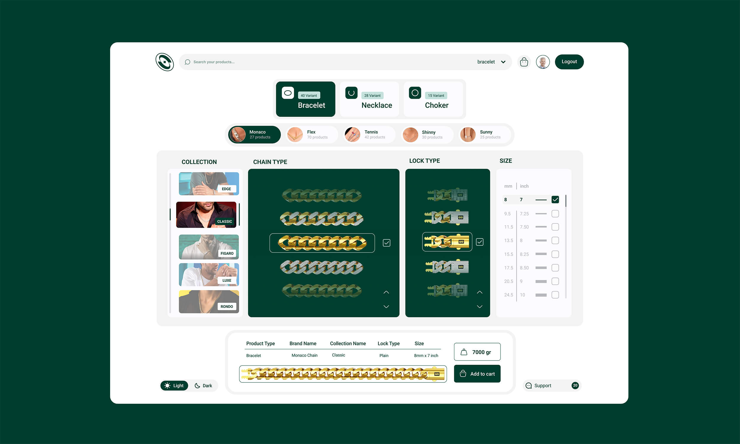
Each product design need a strong UX information architecture,
navigation, page hierarchy, and workflow patterns. From there, the
UI was built in a user friendly system. The target of the concept is to
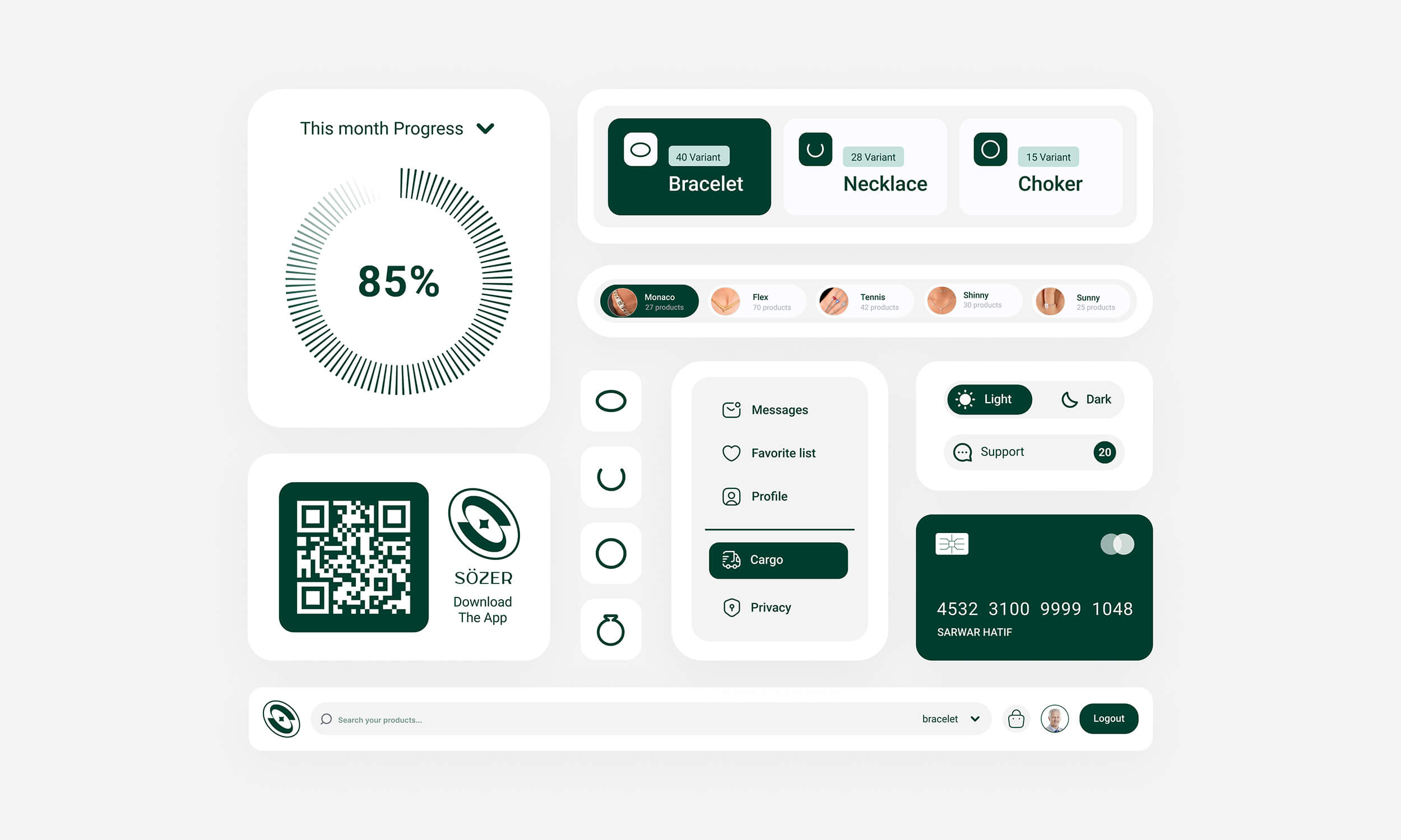
reduce contrast on nisy pages, using the correct color palette for all
elements tables,nowadays which they are prevalent. This new user
interface increases contrast to focus the user on important elements,
which any user can easily distinguish the highlighted green colors.
All the design elements are in a harmony that is why it creates a soft
UI.
view on dribbble: dribbble


